
F.A.U.Lisboa
Master’s — Communication Design
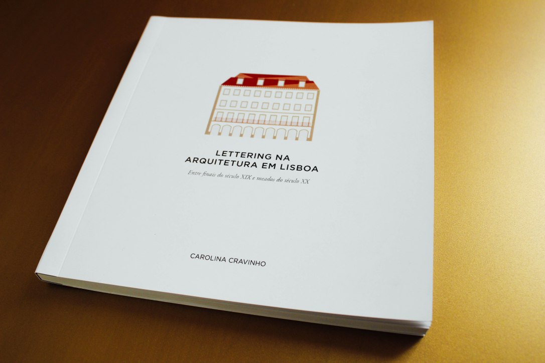
Master’s Dissertation theme — “Lettering on Architecture in Lisbon
between the late nineteenth century and middle of twentieth century”
2013 — 2015 Lisbon, Portugal
In this Communication Design course we focused in some subjects such as editorial design, infography, interaction design, exhibition, advertising, packaging, printing artworks, branding and typography.
Starting my master’s degree actually was quite challenging. I only had a background of Photoshop and AutoCad and other rendering software related to 3D representation of architecture so I had to start learning programs that my classmates already knew. At the beginning they could work faster than me, but I easily learned Illustrator and InDesign and with their help I learned some tricks.
We had to do some projects related to web design and video edition however this subjects weren’t fields that they taught us how to preform, some of us had to improvise or some already had some knowledge background. I think that we should have had that opportunity, they instead taught other theoretical fields that weren’t so relevant. Today we need to apply these practices and it’s a pity that some of us didn’t learned as we should in a Communication Design course.
One of those projects where I miss to have learned better was a short-film performing which I took part in a team work. Only one of our classmates knew how to use a decent software for editing videos which have learnt in an earlier multimedia course. Also we didn’t have the opportunity to attend the edition in person. Despite this it was nice to be part of the direction together with my classmates which resulted this beautiful and inspiring video about life.
“The Compass seeks to recover the principle of Carpe Diem while following a course of life. The sound of the piano is the guiding thread of all the existential stages, being the only element in a time-line guided by the transformation that inevitably leads to the end.”

Apart of the practical there was one of the theoretical subjects that we needed to give more attention and it was a good contribution to apply in the end of the year – in our final Project/Thesis. At first I didn’t have an idea to defend for and so in order to achieve more experience I wanted to apply for an internship. Unfortunately I couldn’t get that opportunity, although there was a deadline to decide what we were going to do so I had to decide to move on and choose to do a final theoretical Thesis/Project. It was the best thing I could have chosen, I love the project and I believe it is very inspiring for the people here in Lisbon that love our city and care about arts heritage.
This project named “Lettering on Architecture in Lisbon between the late nineteenth century and middle of twentieth century”, aims to reflect on the different styles, creations and technical approaches of lettering applied on buildings, in order to evaluate the existing historical context through interpretation and analysis of the used lettering.
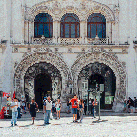
The Lettering applied on the architecture of Lisbon, between the late nineteenth century and middle of twentieth century, appears as a real contribution to the urban landscape, creating a strong cultural identity. Lettering on architecture also helps to identify the function of buildings, contributing for the citizen’s guidance and adding visual value to the urban space.
The project consists on a creation of a photography book which has photographic records of the different lettering compositions with its address corresponding to the place where they are. It will be through these photographs that we will visualize the different lettering styles found on the streets of Lisbon, organized in accordance to their technological aspects of production and according to their relation with each building.
As a contribution to a perception and notion of space, there was made an urban representation through a map of Lisbon. The blocks marked with color correspond to the places where the lettering styles were photographed.
Meanwhile, in November of 2016, I was invited to publish my project on the website of the 7th edition of the Typography Meeting that took place in my University. Take a closer look here.
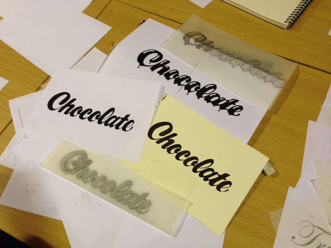
During this Design formation I realized that I loved everything related with typography. This is the main reason I chose to do this thesis project. So instead of only studying the theoretical part of calligraphy and lettering I decided to learn a little more by participating in workshops. This was an interesting way to learn more techniques on a practical way. I bought some materials, started to practice and joined the following workshops:
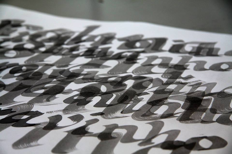
Calligraphy
Faculdade de Arquitetura da Universidade de Lisboa
10/2013 — 12/2013
Calligraphy practice
Lettering
Halfstudio
10/2015
Drawing lettering techniques
Go to previous Architecture or take a look at the links below:


